
- July 1, 2021
- Data Visualization
Our #DataReads series curates links and examples for those looking for an introduction to a particular civic data topic.
Data visualization is an important tool — and practice — for government leaders and officials. As data becomes more open, easier to collect, and more expected by the public, local leaders are working to clearly and efficiently disseminate all of this information to both public and internal stakeholders.
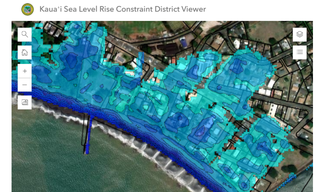
By visualizing information, city and local officials can unlock data-driven insights; they can literally “get the picture” by seeing data portrayed in an illustrated manner. One example of this is a visualization tool used by the city of Charlotte, North Carolina, to determine appropriate locations for affordable housing. Traditionally Charlotte’s city council would receive site requests from developers, and provide either a yes or no to their proposed affordable housing sites. The city’s Housing & Neighborhood Services' department saw this as a process that could benefit from more data-driven decision making, and used this opportunity to develop a data map that could uniformly score each proposed site along four measures: proximity to amenities, car and public transit access to jobs, neighborhood change score, and neighborhood diversity. Now, council decisions are made in a more transparent and equitable way, and city officials can see where more space is needed and how to improve the city through rationally-placed affordable housing.
Simply having a dashboard available doesn’t immediately translate to more engagement and transparency. The dashboard, map, or visualization must be easy to use and understandable to everyone, particularly those with little experience in data analytics. Professor Stephen Goldsmith argues that the most crucial aspect of data visualization is its “accessibility to a wider audience so that the number and types of users continue to expand.” Many public data dashboards are complemented with community-based training and public engagement to introduce residents to the dashboard or map, help them utilize the technology, and explain how they can make new visualizations with the available data.
For example, Charlotte’s affordable housing tool mentioned above was rolled out with several community meetings and outreach sessions, according to Warren Wooten, the city’s Housing Services Operations Manager. In Little Rock, Arkansas, the community is engaged in data collection that helps the city picture where street light improvements are needed. During a community meeting, residents raised an issue that hadn’t surfaced in the city’s original data; many street lights in the city had blown out or weren’t functioning. The city connected community members with local college students, who went out in pairs and groups to tag broken lights in the Little Rock 311 app — one pair even turned this into a Pokemon-GO style game. Thanks to the community’s efforts, the Public Works Department used the map of 311 reports to guide their repairs and quickly fix the lights.
When data-driven decision making is the end goal, everyone must be able to start from a shared understanding. After all, open data isn’t really open if it’s simply raw data. Visualization is a key method for making it more accessible; not just usable, but useful.
To learn more, here are some helpful resources to check out:
- How — and why — to consider equity when creating data visualizations: Do No Harm Guide: Applying Equity Awareness in Data Visualization
- Best practices for making public COVID-19 dashboards: Best Practices for COVID-19 Data Visualizations
- Know the best tools for visualizing open data: Visualization Tools for Open Government Data
- Listen to urban Chief Data Officers give practical examples on this webinar: The Power of Data Visualization in Cities
- Review the searchable database of visual and geospatial solutions to critical urban problems: Solutions Search
- What dashboard designs are scientifically shown to produce transparency and accountability: Data Science Empowering the Public: Data-Driven Dashboards for Transparent and Accountable Decision-Making in Smart Cities