- July 30, 2018
- Civic Data
To demonstrate the inaccuracy of Amazon’s facial recognition technology, the ACLU of Northern California ran a simple test: They took photographs of all 535 members of the U.S. Congress and scanned them against 25,000 mugshots—none of which were of congressmembers, mind you. In the end, the system, known as Rekognition, generated 28 hits—that is, the system mistook 28 members of Congress for criminals. Even worse: Rekognition disproportionately misidentified people of color, with six of the 28 matches being members of the Congressional Black Caucus.
The ACLU’s demonstration was simple, effective, and more than a little bit clever. The choice to use mugshots was an important one. Presumably, any set of photos—for instance, profile pictures skimmed from Facebook—would have served just as well to demonstrate Rekognition’s inefficacy, but this would be missing the point. Without context, a false positive rate of 28 out of 535 (about five percent) doesn’t sound so bad. In real life, though, some mistakes rob innocent people of their freedom, even of their lives, and in such cases, five percent is far from tolerable. This is even before mentioning that the false positive rate is higher for those with darker-colored skin.
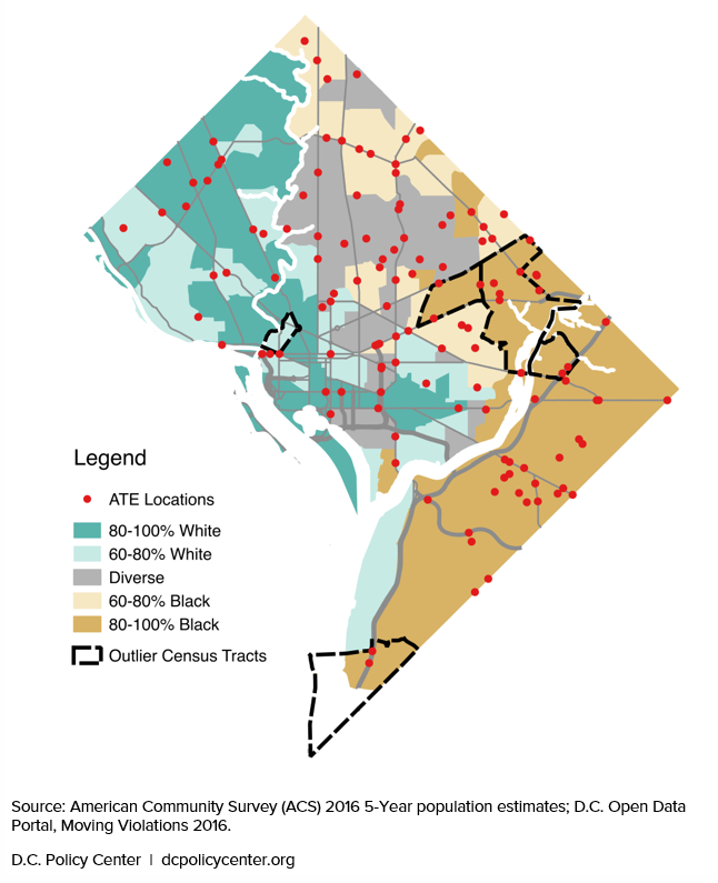
Sometimes, though, discrimination eludes simple illustrations. This was the challenge that William Farrell, a contributing fellow at the D.C. Policy Center, recently faced when looking into the possible discriminatory effects of D.C.’s efforts to end traffic deaths and serious injuries by 2024. His specific interest was automated traffic cameras, which now account for most of the moving violations issued in D.C. (96 percent of citations and 97 percent of fines). Traffic cameras, like facial recognition software, are touted as a ‘neutral’ method of law enforcement: Since the camera sees only the speeding car and not the person driving it, there is no possibility of it selectively enforcing the law the way that a racist cop might. However, Farrell believed that the District’s highly segregated racial geography might allow for disparities to arise anyway.
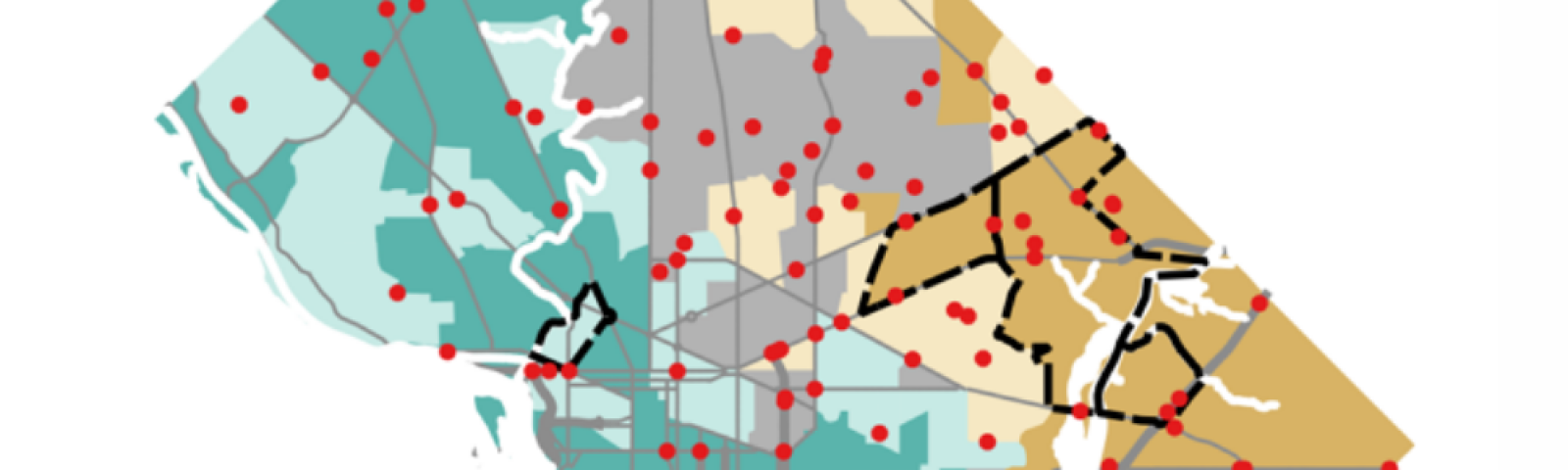
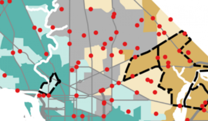
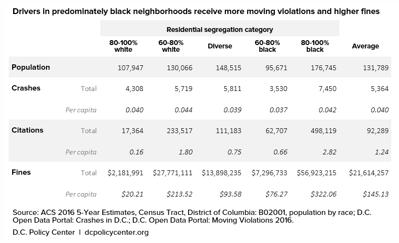
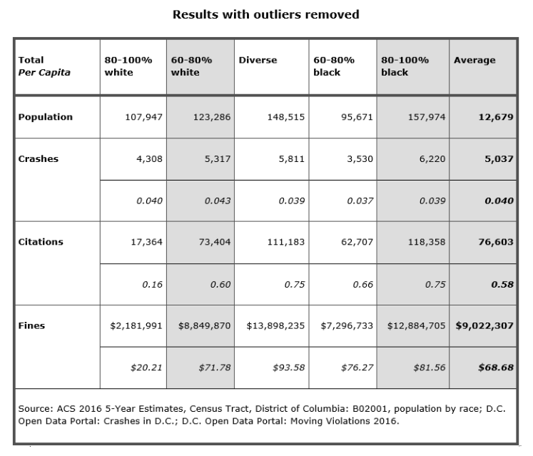
And disparities he found. Using geospatial data from the D.C. Open Data Portal, Farrell calculated that a person driving in areas with mostly black residents is over 17 times more likely to receive a moving violation than in an area with mostly white areas. This is despite the fact that the number of crashes per capita is pretty much the same across the board: 0.040 in 80-100 percent white residential areas versus 0.042 in 80-100 percent black residential areas. (And though this difference is already so small, it’s worth noting that the per capita rates are 0.044 and 0.037 for 60-80% white and 60-80% black areas respectively.)
Farrell notes that the huge difference is largely the result of a few outlier census tracts. Of the five outliers, four were located in predominantly black neighborhoods, and it was often the case that their results were driven by a single camera producing an order of magnitude more citations than the average. The outlier tracts can be seen below.
With the outlier tracts removed, rates of citations and fines even out considerably, with the exception of 80-100 percent white tracts, which receive less than a third of the average number of citations.
Again including the outliers, Farrell’s by-rank graph illustrates well how big the difference between the five outliers and the rest really is.
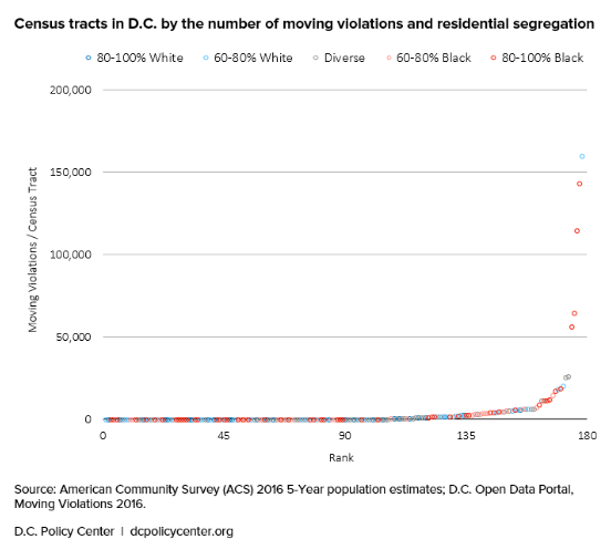
Arguably, then, the 17-times-more-likely statistic is a bit misleading on its own. Individually, most majority-black neighborhoods are nowhere near 17 times more likely to receive citations and fines from speeding cameras. Instead, the problem is that four of the five outlying tracts for citations and fines are located in majority-black neighborhoods. From this, Farrell concludes that it is likely that black D.C. residents—specifically, those who reside in four of the five outlying tracts—suffer the brunt of traffic camera enforcement in the District, since it’s fair to assume that they often drive in the neighborhoods in which they reside.
Hampering a shocking statistic with a litany of contextual qualifiers robs it of some of its impact, but it’s important to state problems precisely before seeking out solutions. The mission of the ACLU’s Rekognition experiment was simple—to show that Amazon’s facial recognition product was too inaccurate for policework—and the solution which the results recommend is also simple: Just don’t use it. But the issue at stake here not whether traffic cameras are able to do what they’re supposed to do. The tech powering traffic cameras is solid, and there’s no evidence to suggest that it’s more likely to notice black drivers or to give white drivers a pass. Instead, the disparity is perhaps the result of their specific placement, which demands a more complicated solution than an outright ban.
Sometimes it is better not to keep things simple. And we should expect as much: Very often, the world is not a simple place. In such cases, the challenge is to find a way to communicate the point of concern elegantly.
Visualizations can help. The problem that Farrell wishes to illustrate is a strange one—namely that, for whatever reason, people appear to be far more likely to speed on a few streets in black-majority neighborhoods—and his rank-violation graph, in combination with his demographic map, communicate that strangeness in a succinct, quickly-digestible manner. With maps, urgency need not be sacrificed for care and precision.
 Daniel is a Summer Research Assistant/Writer for Data-Smart. He graduated from Williams College with degrees in Philosophy and Mathematics.