- February 12, 2018
- Data Visualization

Map: U.S. Veterans
Geographic Area: United States
Year Published: 2017
Goal: Increase awareness of how veterans are faring in cities across the United States.
Datasets: 2016 American Community Survey
Pledging to serve veterans has become a regular feature of American campaign speeches. From ambitious proposals like creating a White House hotline or veterans job corps to more pedestrian suggestions like expanding services in rural areas, politicians at all levels have made veterans issues a key campaign tool. However, governments have not always delivered on promises to take care of their veterans, and many former military members still struggle to adapt to civilian life.
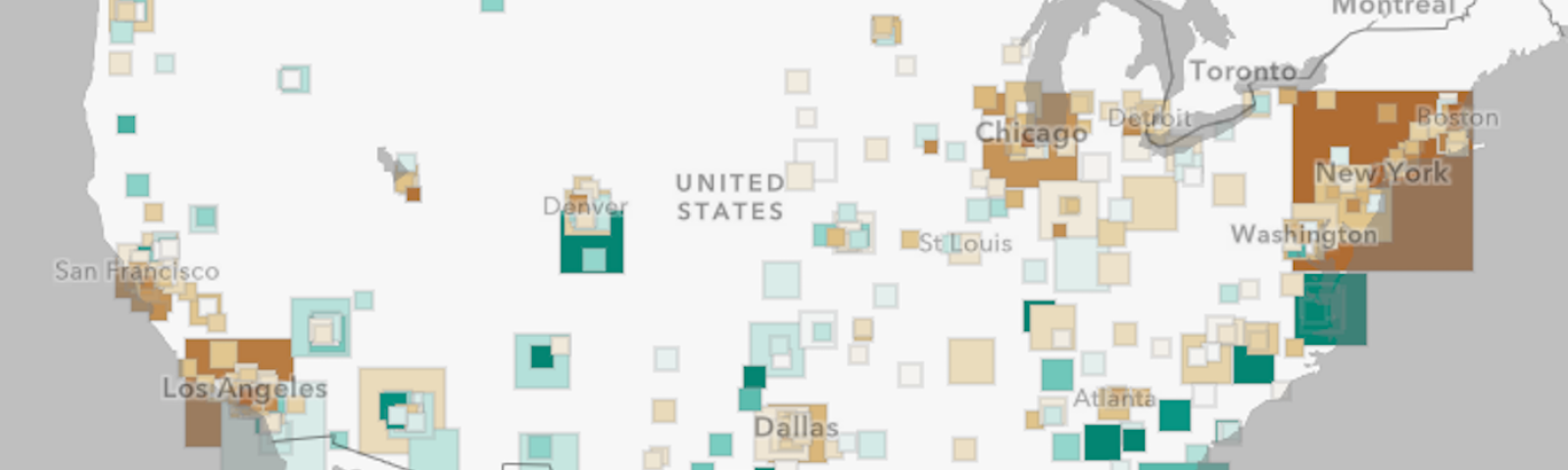
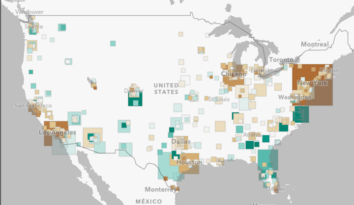
Quality of life for veterans varies from city to city, depending on the services departments of veterans affairs provide, the job opportunities employers offer, the community culture, and more. The U.S. Veterans story map from Esri shows how American veterans are faring in cities across the country. Using data from the 2016 American Community Survey, the map displays percent population, median income, and predominant period of service for veterans in cities.
Using this visualization, cities can seek to model their interventions on the efforts of municipalities that have had the most success with veterans. And, in cities where veterans appear to be struggling, residents can use the map as an advocacy tool, calling for changes.
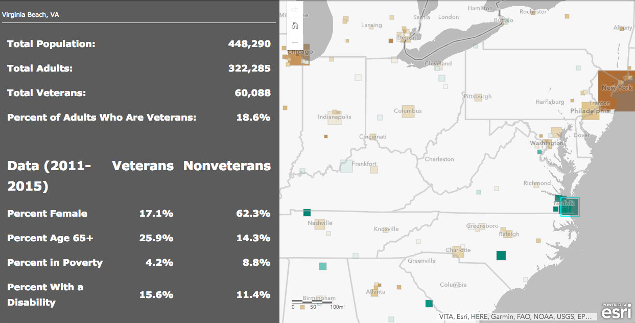
The percent population of veterans is one indicator of city success at serving its residents. Cities like Virginia Beach, VA and Colorado Springs, CO have some of the highest percentages of veteran residents, which likely reflects these cities’ affordability and proximity to military bases. On the other hand, Miami, New York, and Los Angeles—prominent, expensive metros with rapidly shrinking affordable housing stocks—have some of the lowest percentages of veteran residents.
Even more indicative of cities’ success hosting veterans, users can see the top 25 cities for median veteran income. The list starts with number 25 Pearland, TX, where veterans’ annual median income was $56,340, and ends with number one Centreville, VA where veterans' annual median income was $99,529. These statistics underscore the success of these communities of creating opportunities for veterans to enter and succeed in the workforce.
Texas and California are home to many of the cities boasting high veteran income, with six and nine cities respectively in the top 25. Both of these states offer unique opportunities for veterans to enter and succeed in the job market. In addition to on-base job opportunities in its many military installations, Texas has a program called the Veterans Land Board, which gives Texas veterans the opportunity to borrow up to $150,000 to purchase land at competitive interest rates. For its own part, California offers veterans tuition waivers to state run schools, opening the door to educational opportunities that improve job prospects. Visualizing the success of these states on the story map may inspire other states to implement creative policies.
And yet, also revealed in this visualization are significant income inequalities between men and women veterans. For example, while the median male veteran in Johns Creek, GA makes $68,167, the median female veteran makes $16,844. The case is similar in Woodlands, TX, where the median male veteran makes $71,280 and the median female veteran $29,779. And so, while other cities might look to these cities for insights on how to improve opportunities for veterans, the visualization also shows these cities that they have work to do in improving prospects for women. Female veterans have asserted that because of their small numbers, they often feel isolated upon returning home and that government services—especially in mental and physical healthcare—fail to meet their needs. This visualization shows the concrete results of these disparities, and many therefore galvanize advocacy.
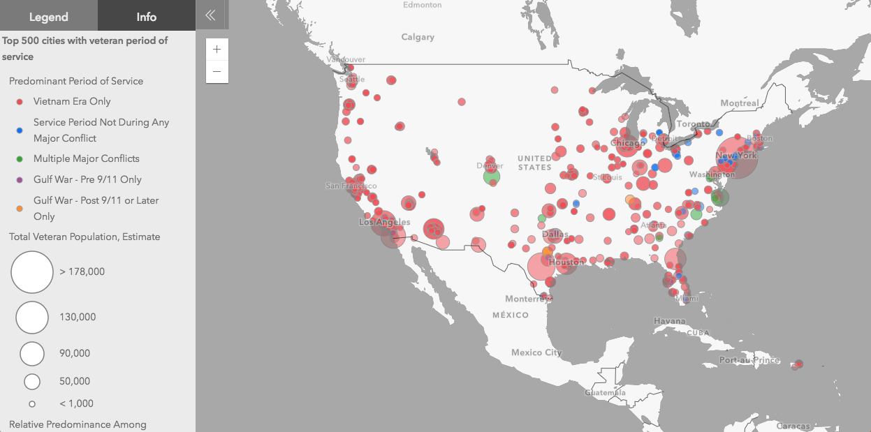
And the final element of the visualization, showing the predominant period of service for veterans in each city, can help cities tailor their interventions to help veterans. Veterans of Vietnam have radically different needs than those of Afghanistan, and so by understanding their demographics, cities can deploy the services their residents need most.
A tool for both policy design and advocacy, the U.S. Veterans story map provides valuable insight into the state of veterans affairs. If used by governments and residents alike, perhaps it will help politicians make good on more of their campaign promises.
 Chris Bousquet is a PhD student in philosophy at Syracuse University. Prior to that, Chris was a Research Assistant/Writer for Data-Smart City Solutions. Chris holds a bachelor’s degree from Hamilton College.