- November 30, 2017
- Map of the Month
![]()
Map of the Month: KC Digital Inclusion Map
City: Kansas City, MO
Year Published: 2017
Goal: Uncover relationships between Internet speed and economic outcomes.
Datasets: FCC data on highest advertised speeds from ISPs, Census poverty data, real-time feed from regional transit on locations of streetcars and buses .
The city of Kansas City, MO has an ambitious vision: to connect all of its nearly 500,000 residents to the Internet. In the city’s eyes, connectivity is not valuable only for its own sake, but as a path towards many other critical goals, like improving education, reducing poverty, and promoting public health. “There’s a homework gap in schools,” explained Rick Usher, assistant to the city manager for small business. “If you get an assignment that you need to be online to complete and don’t have Internet at home, that’s going to be difficult.” The same goes for increasing uptake of city services, as Usher explained that the city is pushing many of its applications online. “Engaging communities through online tools only works if people are online,” he said. Even health outcomes can depend on connectivity, as the city pushes out critical public health messages online.
In order to help the city achieve its goal of ensuring access for all residents, the city’s innovation office sought to understand the current state of Internet connectivity across Kansas City’s neighborhoods. According the city’s chief innovation officer (CIO) Bob Bennett, Usher wanted to find a way to make this information readily accessible across the city to make digital inclusion more salient. In response, Bennett said “Let’s just put it on a map.”
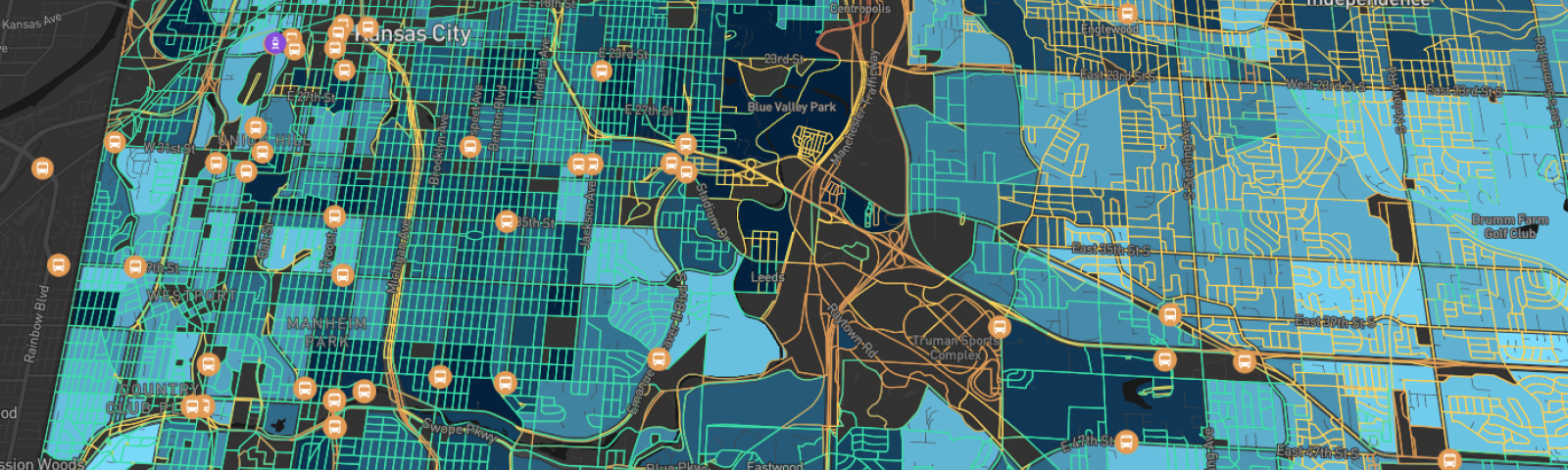
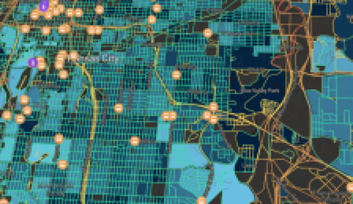
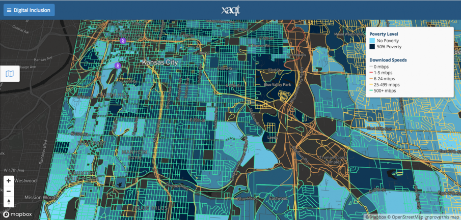
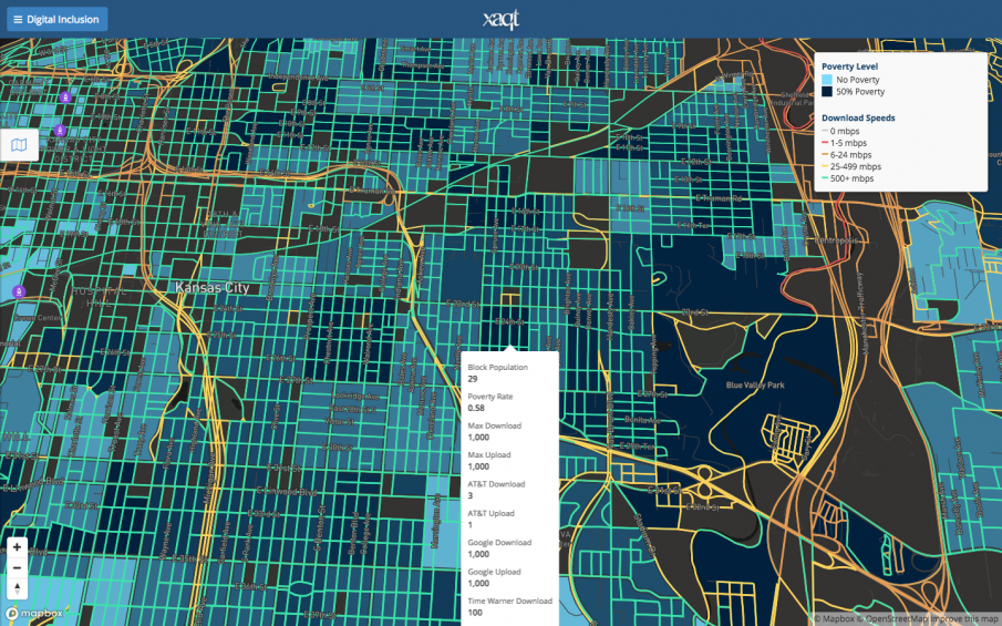
The result of this vision was the KC Digital Inclusion Map, an interactive visualization of Internet speed across Kansas City—the latest winner of Harvard’s Map of the Month. The map overlays public FCC data on Internet service providers’ (ISP) highest advertised broadband rates with Census poverty data in order to uncover relationships between connectivity and poverty. The creators also included a real-time feed from regional transit that provides insights into resident access to faster broadband speeds via public transportation.
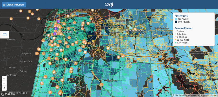
This visualization was chosen as Harvard’s Map of the Month for its ability to reveal insights on the far-reaching influence of Internet connectivity. By comparing broadband speeds and poverty data, the map shows a correlation between high-speed Internet and resident’s economic prospects, and displays this relationship in a striking UX.
To create the map, Kansas City reached out to Chris Crosby, CEO of digital services company Xaqt and a collaborator on many of Kansas City’s previous smart city initiatives. Crosby accessed publicly available fixed broadband deployment data from FCC Form 477 filings by Internet service providers and used Xaqt’s Smart City Engage platform and a MapBox engine to transform this data into a visualization.
According to Crosby, the design process that followed was “very iterative.” Bennett and Usher user-tested the map at a meeting of the city’s digital inclusion coalition, an advocacy group of Kansas City area nonprofits, individuals, government entities, and businesses focused on fostering Internet access in the city. “We piloted a demo of the map at this meeting and made some key changes,” said Bennett. For example, attendees found the initial map’s display of Internet speeds—originally in the form of tower graphs—a bit busy and distracting. As a result, at the recommendation of an intern, Kansas City decided to represent broadband speeds via different colors on city streets, making the map cleaner and more readable.
This visualization serves in part as a tool for exhibiting to city departments the value of digital inclusion. By showing that Internet access is correlated with economic outcomes—particularly on the east side of the city, which has low Internet adoption despite competitive offerings from multiple ISPs and suffers from high rates of poverty—the Digital Inclusion map shows departments across the city that digital inequality affects them. “We wanted to bring more city departments into the conversation about digital inclusion,” Usher explained. Going forward, the city plans to add layers like educational achievement and public health outcomes to further emphasize the cross-sectional implications of connectivity.
But more than a tool for gaining buy-in, by showing the distribution of Internet speeds across the city, the visualization actively supports Kansas City’s efforts to close the connectivity gap between different neighborhoods and simultaneously address other inequalities. According the Bennett, the map will inform the implementation plan for the city’s digital inclusion strategy—a key part of the Digital Equity Strategic Plan recently passed by the city council. “This map helps us ensure that we direct resources to the parts of town where they’ll be most effective,” said Usher. Doing so will help the city improve educational, economic, public health, and other outcomes.
The visualization also provided the city with insights into some of the causes of and solutions to anemic Internet adoption in certain neighborhoods. “We realized that the greater digital challenge was not the availability of fiber itself, but the adoption into the digital world,” said Bennett. “The green speeds in our underserved neighborhoods indicate that Internet connectivity at gigabit speeds exists there, but usage rates for city digital applications or participation in digital economic endeavors shows a great disparity in other data sets.” A number of ISPs offer high-speed Internet to low-income residents at a reduced rate, as low as $15 month. And yet, though the map shows that high-speed access exists in low-income areas, city data shows little Internet activity in these neighborhoods, meaning many residents still choose not to subscribe—either unaware of reduced rates or of the mind that Internet is an unnecessary luxury.
As a result, the Innovation Office’s focus has been on educating residents in areas with low uptake on the availability of low-cost options as well as the critical importance of the Internet in education, employment, and other areas. “As a city, we support the efforts of community groups like Kansas City Digital Drive, Connecting for Good, Surplus Exchange, Literacy KC and others to expand competency in computer skills across all 318 miles of our city and 8,000 miles of our metro area,” Bennett explained.
Local non-profits and residents can also benefit from the visualization in their efforts to improve digital inclusion. Organizations can use the map to see where residents lack high-speed Internet connection and improve digital education and advocacy in those areas. “Our community works closely with Connecting for Good, an organization that does work for both physical connectivity and basic connectivity training,” said Bennett. Residents can also see in which parts of the city they can access high-speed connections. According to Bennett, the map will soon include layers that show where all the computer centers and libraries are located in the city so that residents can find places to access the Internet even if they don’t own a computer.
The KC Digital Inclusion Map highlights data visualization as yet another tool in Kansas City’s Smart City arsenal—which includes a connected streetcar, interactive kiosks with free public WiFi, and smart streetlights. “The ability to transform raw data into elements that support rapid and accurate solution is a hallmark of 21st century government,” said Bennett. It is yet another reminder that data visualization is just as important as flashy projects like Internet of Things sensors or digital kiosks, and can in fact make their implementation all the more effective.
 Chris Bousquet is a PhD student in philosophy at Syracuse University. Prior to that, Chris was a Research Assistant/Writer for Data-Smart City Solutions. Chris holds a bachelor’s degree from Hamilton College.