

- March 13, 2020
- Public Health
COVID-19—a new type of coronavirus that causes respiratory illness and fever—has been at the forefront of the world’s attention since the first cases emerged in China in December 2019. Since then, evidence suggests sustained transmission of the virus has spread to more than 100 countries across six continents, qualifying the illness as a global pandemic according to the World Health Organization (W.H.O.) on Wednesday, March 11th.
Coupled with COVID-19’s exponential growth are vast amounts of uncertainty and a lack of a standard operating procedure to handle potential cases, both of which have contributed to worldwide anxiety and the spread of misinformation about COVID-19. In this post, we’ve collected an inventory of interactive maps and resources that are keeping track of the most up-to-date information and data on the virus.
Center for Systems Science and Engineering (CSSE) at Johns Hopkins University (JHU)
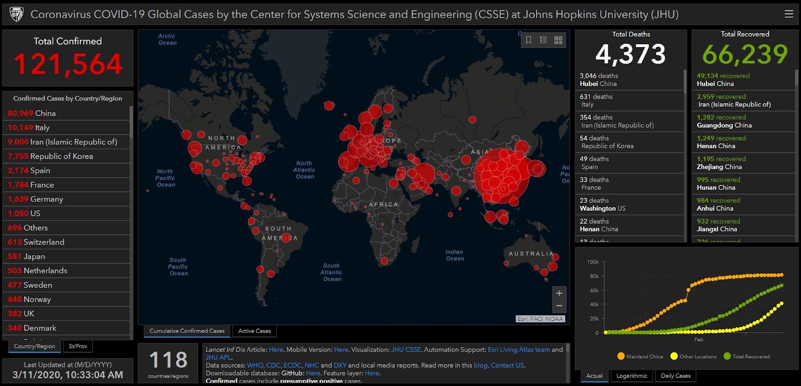
One of the most popular dashboards has come from Johns Hopkins University’s Center for Systems Science and Engineering (CSSE)—it has been visited over 200 million times with visitors from nearly every country in the world. Modeled from a previous dashboard created to track measles risk in the United States, this map is one of the most comprehensive interactive dashboards delving into the worldwide spread of COVID-19, detailing the number of confirmed cases, deaths, and recoveries in addition to the visual map. The dashboard allows the user to zoom in on any country or location with confirmed cases and learn how many active cases those areas are still monitoring. Furthermore, the user can choose between several different base maps to find near real-time updates all over the world.
Thebaselab - Coronavirus Map
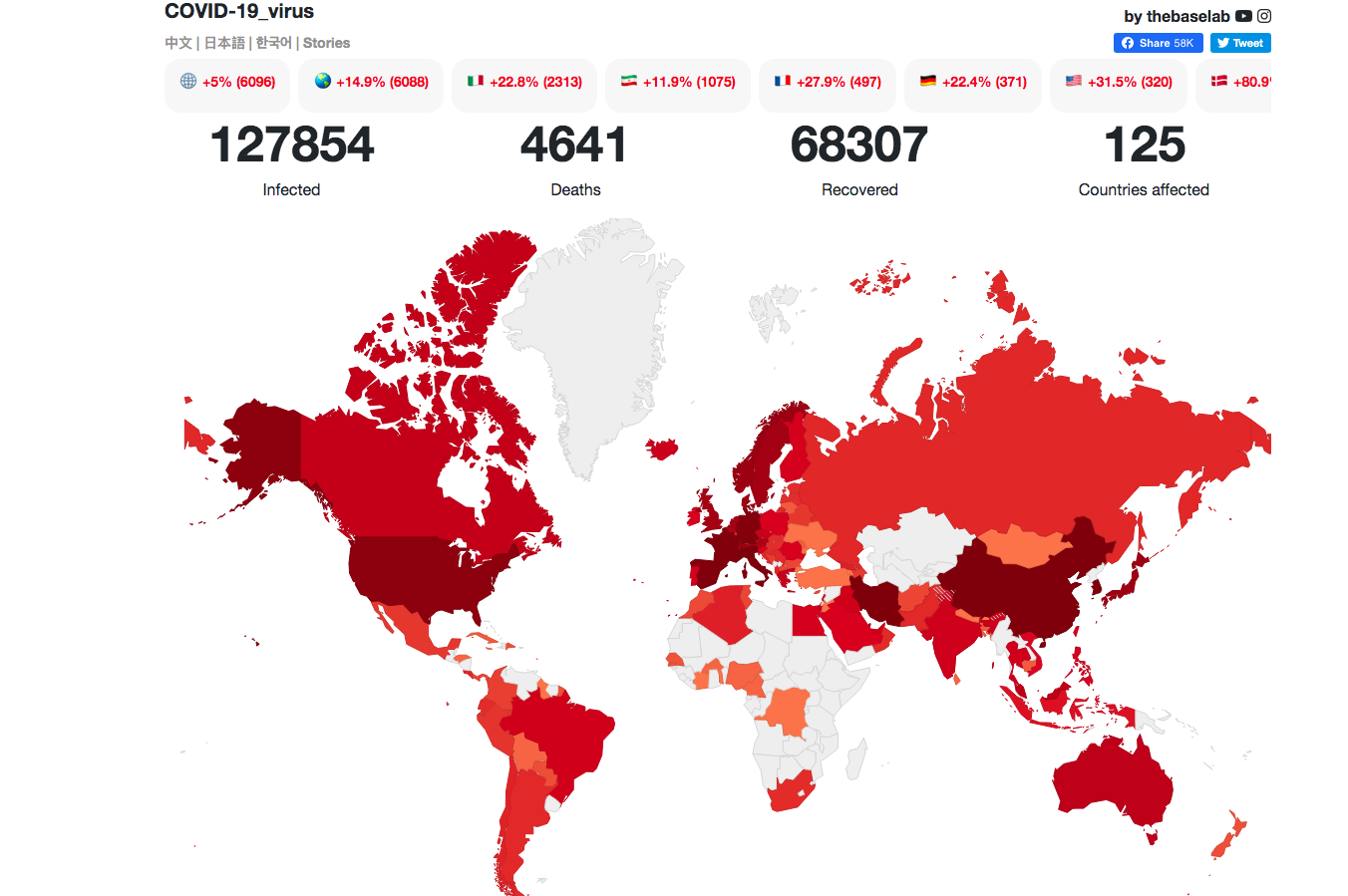
Like Johns Hopkins CSSE’s dashboard, thebaselab provides near real-time information on COVID-19 globally. The map contains the statistics and data from known cases in every country affected so far, with a map that allows the user to hover over a country to see how many cases are confirmed in the region. The dashboard also provides information graphs on the frequency of confirmed cases broken down by country in addition to live news updates on the virus from around the world. Thebaselab also publishes its own stories on the dashboard comparing COVID-19 to other epidemics, how the disease spread, and data visualization analysis of conversations regarding the disease online.
World Health Organization (WHO) Health Emergency Dashboard
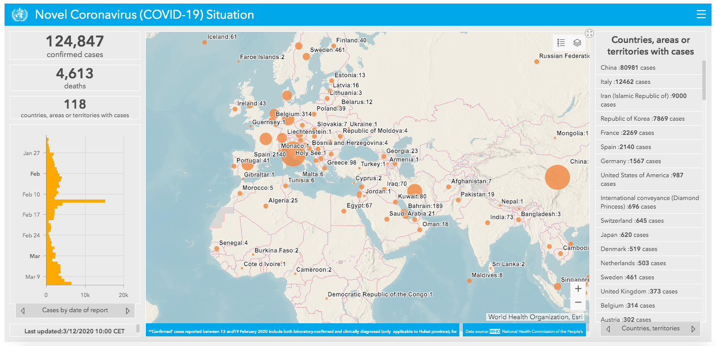
The WHO utilizes a map-based dashboard, illustrating the location and relative size of the outbreaks with orange dots codifying the number of confirmed cases. Filters allow the user to view the map either by “country” or “province, autonomous region, and municipality.” The WHO also provides a graph that can show either the timeline of cases by their date of report or a timeline of cumulative cases. Furthermore, the WHO has an additional dashboard that visualizes COVID-19 affected companies in comparison to other current health emergencies.
UpCode Academy - Singapore Data

UpCode Academy’s dashboard scrapes data provided by Singapore’s Ministry of Health’s own dashboard, which is known to have exceptionally detailed COVID-19 case data—despite causing some privacy concerns. As a result, this dashboard only represents confirmed cases in Singapore. However, the dashboard compiles and delineates information and trends from cases broken down by age, gender, nationality, and location on the island. Other information includes the average recovery time from COVID-19 and a timeline for cases across the region since January.
NextStrain

NextStrain’s dashboard is by far the most technical and provides a very niche collection of information and data from labs around the world that are sequencing the coronavirus genome. The data pictured centralizes that data into a genomic tree. There are also options to display the genomic tree through different formats, in addition to an animated timeline of worldwide transmissions and data filters to view data by location, administrative division, country, authors, or submitting labs.
The New York Times Coronavirus Map

The New York Times’ dashboard provides an easy-to-use and easy-to-understand primer on what’s happening all over the world regarding the virus. The multiple maps and charts provide breakdowns of how each continent has been affected, and how each region is working to contain COVID-19. Other graphs illustrate the number of cases in countries with the worst outbreaks, the ratio of individuals who have died or recovered from the virus, as well as a detailed map of reported cases in the United States.
HealthMap

HealthMap, a team of researchers, epidemiologists, and software developers at Boston Children’s Hospital that began in 2006, has become a leader in employing informal online sources of information for disease outbreak monitoring and surveillance of emerging public health threats. While providing perhaps the least amount of information on this list of resources, the HealthMap does supply a valuable global map of COVID-19. The user can play an animation to see a timeline of how the disease has spread across the world.
Centers for Disease Control and Prevention (CDC)

The CDC dashboard provides standard information that is mostly useful to those within the United States. Their website does not have interactive maps but provides an overview of cases, deaths, and locations in the country that have been affected as well as a breakdown of those cases by reported sources of exposure. Additionally, the CDC provides information on state testing as well as a timeline of COVID-19 cases by date of illness onset. The CDC website is regularly updated with the latest information at noon Mondays through Fridays.
University of Washington - Novel Coronavirus Infection Map

The Humanistic GIS Lab at the University of Washington - Seattle created a dashboard using data from the WHO, CDC, the Public Health Agency of Canada (PHA), China CDC, MapMiao, and Baidu. The dashboard contains both charts on the global trend of the spread of COVID-19 as well as maps from CartoDB and ESRI. The dashboard allows the user to choose between ESRI or CartoDB maps as well as filter information by infection level, infection cases, and infected communities. The map further allows the user to zoom in on affected regions and visualize the spread between individuals.
University of Virginia Biocomplexity Institute

The University of Virginia (UVA) Biocomplexity Institute’s dashboard is another well-informed source of information that includes interactive maps and graphs that can be filtered by confirmed cases, deaths, and recovered cases. The user is able to hover over the graph to see specific data on a particular date as well as adjust a time slider on the map to watch how COVID-19 spread globally. The dashboard is populated from information provided by open source datasets.
Additional Resource: Coronavirus Local Response Initiative
To help American mayors respond to the fast-paced and evolving Coronavirus pandemic, Johns Hopkins Bloomberg School of Public Health, the Bloomberg Harvard City Leadership Initiative, and Bloomberg Philanthropies have partnered to launch a new educational program. Bloomberg Philanthropies will work with partners to identify the needs and lessons learned from cities affected by COVID-19 outbreaks in real time to share with other cities in an effort to get ahead of the disease’s spread. With public health expertise from Johns Hopkins Bloomberg School of Public Health, this network will be consistently updated with the latest information from the CDC. The Bloomberg Harvard City Leadership Initiative will also host virtual convenings with experts from both the Harvard Kennedy School and Harvard Business School on crisis leadership and communications. For more information and how to apply, please click on the link above.
For Harvard-specific information regarding the virus please visit https://www.harvard.edu/coronavirus