- April 6, 2020
- Data Visualization
This article originally appeared in Governing.
In times of crisis, particularly in the age of social media and the viral spread of misinformation, it can be difficult for people to know what information to trust and whom to listen to. Many public health experts are calling the coronavirus outbreak an "infodemic," in which the public overshares information, some of it false or misleading, that can result in more-deadly consequences. Yet in the face of this, local government leaders must take decisive action and instill confidence.
In a recent Governing column, we highlighted the need for local leaders to act courageously in the face of COVID-19 by breaking down bureaucratic barriers and then calling on the public to make painful sacrifices. This latter part is arguably the most difficult, as most people's livelihoods depend on bringing home a paycheck. The greater the sacrifice needed in times of crisis, or the greater the aspiration in better days, the more important it is for local and state leaders to build the foundation of a shared narrative.
Illinois Gov. J.B Pritzker very helpfully began a recent press conference with an outline of the sources of information he employed and an explanation of his decision-making framework before issuing a statewide stay-at-home order. But words or text are more likely to bring people together and inspire action when painted with context. So how can public leaders better communicate this context to residents?
For help, we turn to the open data movement for some powerful lessons, one of which revolves around how data is visualized. Open data, when not visualized in a way that is understandable to the user, is not really open at all. So how can a leader clearly demonstrate our interconnectedness and need to take individual action regardless of the economic costs?
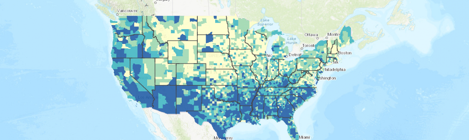
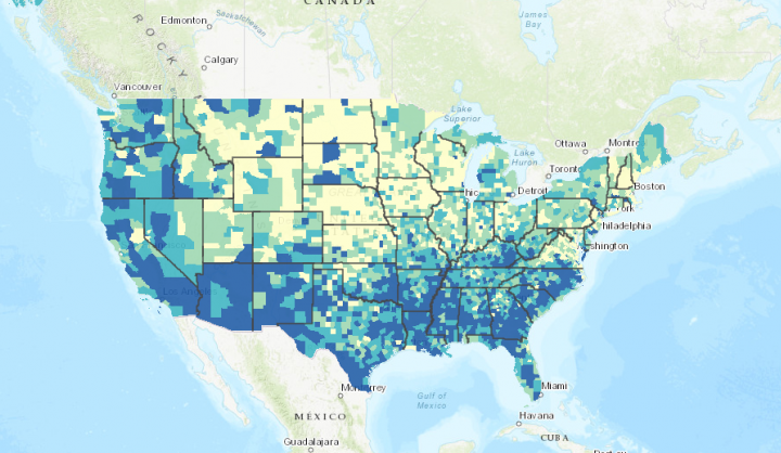
Maps are a particularly powerful data visualization tool, but simply visualizing the spread of disease may not be enough to inspire residents. Maps have to be personal, and they have to tell a story. Take, for instance, the Centers for Disease Control and Prevention's Social Vulnerability Index (SVI) map shown below. This map was initially built for emergency responders, highlighting census tracts across the country with higher levels of vulnerability to disasters based on 15 social factors grouped into four primary themes: socioeconomic status, household composition, race/ethnicity/language and housing/transportation.
Beyond helping emergency responders prepare for and respond to disasters, local leaders can use the SVI map to create a shared sense of responsibility and collective action by literally placing residents in reference to their most vulnerable neighbors. This tactic puts the public in the center of the story and can help people better understand the risk they pose to others by failing to take necessary protective measures. Local leaders can promote and customize this interactive version of the SVI map, or they can generate maps of their local areas using the CDC's SVI county map generator.
It is also important for local leaders to tailor their messages for a range of communities. For example, maps showing seniors living alone, where the population density is highest or where those without health insurance live can help with targeting not only resources to different communities but also messages to them.
Research has shown that statistics and numbers by themselves are not as effective as storytelling at inspiring action. When coupled or overlaid with visualizations showing the rapid spread of COVID-19, visualizations like those featured here can be used to highlight our inherent interconnectivity — how we must depend on one another to get through this. Effectively communicating that message is where mayors and local leaders come in, creating a shared narrative personalized for residents.
 Stephen Goldsmith is the Derek Bok Professor of the Practice of Urban Policy at the Harvard Kennedy School and the