- September 1, 2020
- COVID-19
More than six months into the COVID-19 pandemic, the virus continues to spread across the globe. Through it all, people from government officials to residents have turned to maps to make sense of uncertainty, to focus and target response efforts, to provide a platform for collaboration, and to monitor and adapt to rapidly changing environmental conditions. If there were ever a moment in history where GIS demonstrated its incredible power, it was this one.
Since the virus hit US shores, we at Data-Smart City Solutions have been tracking GIS best practices in the coronavirus response. Here we want to highlight some key themes that have emerged.
Helping the Public Assess Risk
With limited and ever-changing information about the virus, it can be difficult for everyday citizens to calculate the risk they are exposing themselves or others to. At the very outset of the pandemic, the two of us highlighted the role maps play in crafting a shared narrative in a crisis. Using the CDC’s Social Vulnerability Index (SVI) as an example, we discussed how government can use maps not just for emergency preparedness and response services, but also for communicating with, and targeting messages to, residents. We demonstrated how the SVI map helps residents understand the challenges faced by their neighbors and helps to inspire a sense of shared responsibility to protect one another. Ever since, we have seen a wide range of maps emerge that were built to help communicate risk and inspire collective action.
In Canada, the COVID-19 Health Dashboard allows Canadians to explore the country’s neighborhoods and gives each a risk score based on the percentage of the population over age 70. As users hover over the map, they can see how many residents live in those neighborhoods with other pre-existing conditions that put them at higher risk of adverse outcomes from COVID-19.
In Singapore, the government created a map to help residents assess risk before going to their favorite parks. The interactive map shows real-time visitor status at local parks, helping residents assess whether or not they should visit a given park.
Additionally, with COVID-19 patients taking priority, other patients with unrelated medical issues have been forced to wait prolonged periods of time for treatment or forgo treatment altogether. This poses a great risk to their health and the health of the public. In Northern Ireland, the government is working to monitor hospital wait times for non-COVID related medical needs. This map can be used by the public to determine which hospital is the best to go to in the event of a medical issue to reduce wait times and the accompanying exposure to the virus.
Helping Residents Locate Essential Resources and Services
With business closures and reduction in critical services such as public transit, it has been difficult for essential workers to get around, and for everyday people to access resources they need like food. To keep residents informed of business closures and operating hours, as well as where they can find food and other necessities, maps have become a critical tool.
In the United Kingdom, bicycles have become a key mode of transportation for essential workers who could no longer rely on public transit. To help these workers find bike shops, equipment, and maintenance services, the “Cycles4KeyWorkers” map was born. Users can search for nearby stores and can even use the tool to help them find the best deals to make biking more affordable.
In New Zealand, residents can stay abreast of changing business hours and other government services using the COVID-19 Public Information Map. The map categorizes each location by service type (e.g., Council Services and Facilities, Emergency Services) and open status. Similarly, the City of Baltimore built the COVID-19 Asset Map to help local residents, particularly those with lower socioeconomic status, find critical resources near them such as youth and senior food distribution sites, primary care facilities for the uninsured, and COVID-19 testing sites.
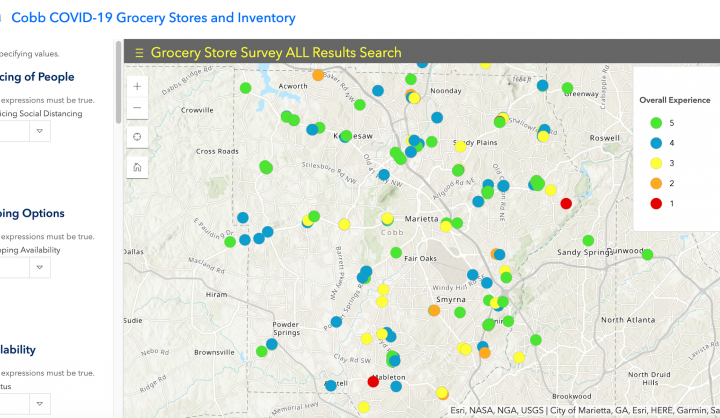
In Cobb County, Georgia, the government has turned to crowdsourcing tools and surveys to keep the public informed. For example, the county has a survey that grocery store patrons can fill out after shopping to help keep others informed about inventory, as well as whether the store is putting protections in place in accordance with CDC guidelines. They have also used these same crowdsourcing tactics to help residents find job openings near their homes, or to find food assistance locations, childcare programs, and emergency medical facilities, among others.
Evaluating Economic Impact and Enabling Business Continuity
Alongside the devastating public health impacts from COVID-19, the economy has taken a terrible hit. However, when focusing in on diverse regional or local economies across the country, the economic impact has not been uniform. GIS has played an important role in understanding these local differences and supporting business continuity.
Early in the pandemic, the Northern Virginia Regional Commission sought to get ahead of the game and track regional differences in unemployment claims across the state. They built a map tracking unemployment claims for Virginia residents by locality. Map users can see where the greatest job losses were occurring and can also see the difference in job loss by industry to assess which types of jobs were being lost at a disproportionate rate.
Taking the Virginia dashboard a step further, Kentucky’s GIS team built the KY COVID-19 Economic Impact Dashboard. The dashboard tracks unemployment levels across different regions and also highlights the economic vulnerability of each of those regions based on the types of jobs that dominate those local economies. The dashboard is being used to measure economic impact, but also to help allocate joblessness services to regions of the state with the greatest need.
In Seattle, the #SupportSeatlleSmallBiz campaign was launched using a location tool to connect residents with open small businesses. With this tool, the public could better target their dollars to help small business remain open, and keep their employees employed. In addition to that, the city government has used the tool to help identify vulnerable small businesses to target millions of dollars in investment to support their needs during this difficult time.
Proactively Highlighting and Addressing Service Gaps and Inequities
In the face of COVID-19, countries that have struggled to gain control of or suppress the virus have been faced with two critical challenges: wide ranging service gaps (i.e., hospital or public health preparedness), and structural, socioeconomic, and racial inequities. This health infrastructure, insufficient and unequal under normal circumstances, in many places quickly became overwhelmed by the scale of the coronavirus pandemic. Aware of this challenge, several governments turned to maps to address these preparedness gaps and inequities.
With limited testing capacity early in the pandemic, the government of Switzerland turned to self-reporting surveys to monitor emerging COVID-19 hotspots. Using a smartphone or computer, residents could take a daily survey reporting their symptoms and current living situations. With this information, the government could assess on a map where current hotspots were in comparison to those emerging in the surveys, and could allocate resources (e.g., testing locations) to areas where the virus was just beginning to take hold.
In Pennsylvania, the Department of Public Health built the Hospital Preparedness Dashboard to track hospital resource needs in near real time. The dashboard shows where hospital demand is surging, and the related capacity of ICUs, isolation rooms, and ventilators. This mapping exercise has been used to help allocate resources to hospitals in the greatest need and to assist in the diversion of patients to other hospitals with more capacity.
Before the pandemic, Syracuse’s GIS and innovation teams were working closely with the school district to identify households without access to broadband or computers at home. When COVID forced schools to close their doors and move classes online, the district was already aware that more than a third of students would not be able to participate without access to these resources. They quickly turned to the maps the GIS team created to target households in need and to make strategic investments that would help make education accessible to all students.
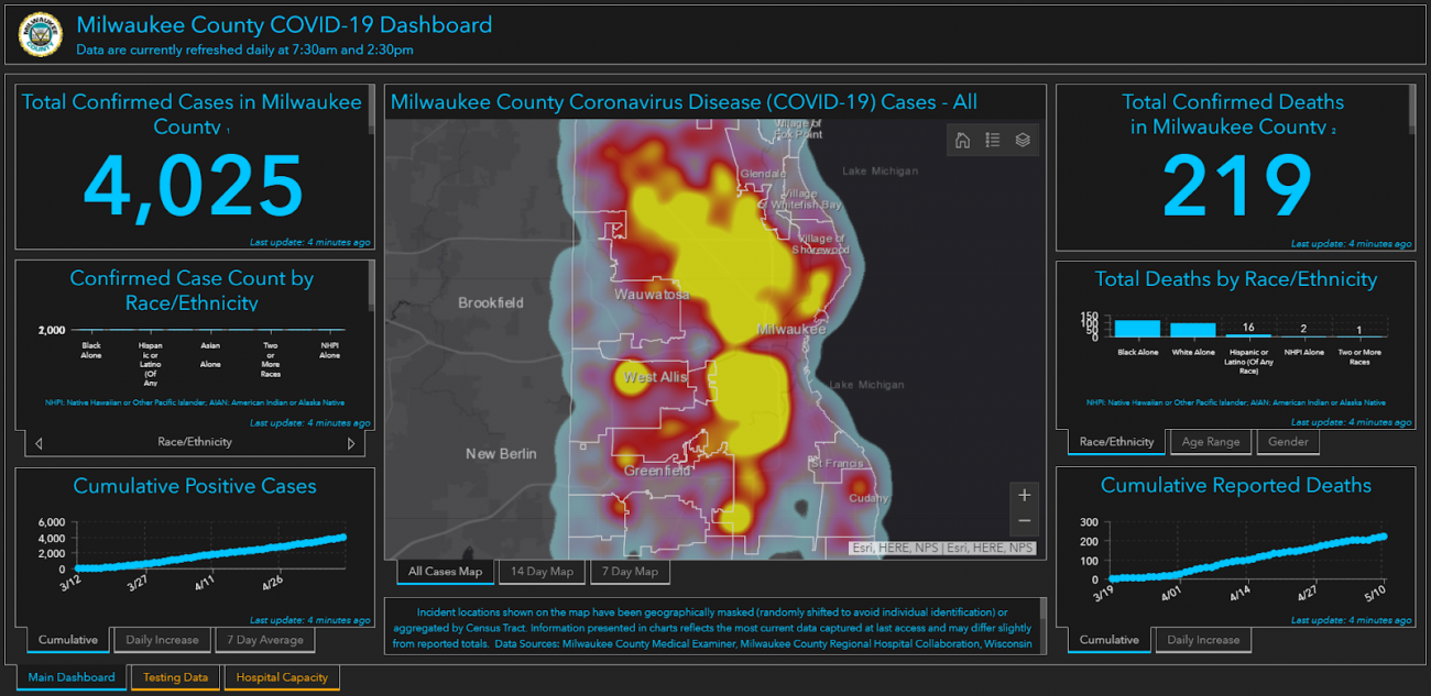
In Milwaukee County, the local government has prioritized the needs of racial and ethnic minorities early on, knowing that they were likely going to be disproportionately impacted both from a health and economic perspective. From the outset, the county’s emergency management director worked with the GIS team to build an interactive map highlighting where the county’s most vulnerable residents live and overlaid that data with socioeconomic and racial data. The dashboard has been used to help address the needs of the hardest-hit residents and to shift resources as the virus spread. St. Louis also built a similar map that focuses primarily on social vulnerability of different neighborhoods.
Keys to Successful Use of GIS in Pandemic Response
In our discussions with local leaders over the last several months, a few key characteristics have emerged that have led to the successful use of GIS in pandemic response:
- Cross-agency and/or cross-sector collaboration. First and foremost, the key to success that those we interviewed repeated was collaboration. Maps have brought together disparate government agencies and other private and non-profit partners to work together using common data and in turn serve as a platform for information sharing. These visualizations have helped to create a shared understanding of the changing nature of the pandemic and to enable a more unified response.
- A holistic view of the on-the-ground conditions through layered data visualization. One uniquely powerful capability GIS platforms provide is the ability to layer seemingly disconnected or unrelated data points on top of one another to reveal trends in ways people or other data platforms may not be able. In the context of the pandemic, with so many areas of society being impacted all at once, GIS tools have helped to make sense of the chaos and paint a more holistic picture of what is happening on the ground, helping local leaders take actions that more effectively address interconnected problems.
- Empathy with the end user. Jennifer Lana, GIS Manager for Cobb County, eloquently said in an interview that, “It is a tough time for a lot of people… We have to step back and look at characteristics and struggles of the community and see what is important to them. There are plenty of tools and applications we can make, but we have to make sure we are doing work to support what they need most right now. Otherwise, these efforts won’t amount to much.” The most successful GIS tools during the pandemic have been those created with the end user in mind, enhancing their usefulness in the moment to help those in greatest need.
Primary Challenges to Overcome Moving Forward
Of course, GIS response efforts throughout the pandemic have been met with a series of challenges that must be continuously addressed to improve outcomes. The primary challenges we have come across in our research are four-fold:
- Working with outdated data and technology. Historically, government has always operated on legacy tools and technology often unequipped to meet the needs of the moment. The pandemic was no exception. In many parts of the country, fax machines became a major bottleneck for information flows that hampered government response efforts. In the unemployment realm, many states are operating on 50-year-old software that made it impossible to handle the influx in applications that came with the waves of layoffs that have occurred across the country.
- Changing organizational culture in government to become data- and technology-driven. The challenges of technology are more than just the hardware or software. One GIS leader we interviewed summed up the problem when he said, “we [in government] have a paper mentality in a digital age.” Due to the outdated systems and bureaucratic rules that have long dictated how government operates, many who work in these roles are hamstrung by systems highly dependent on paper. Data literacy needs to extend well past the GIS technical team to a much broader number of operational and policy officials who can better plan their responses through data-driven insights. Some cities including San Francisco and Denver have launched internal data academies designed to bring skills to interested employees.
- Making decisions/being decisive with incomplete data. Even when governments have been data-driven in their responses, the data they often work with is outdated or incomplete. For example, testing data in some places can still take several weeks to come back, meaning that hotspot data that does not include additional sources such as hospital reports will not actually reflect current conditions. We can’t let perfect be the enemy of the good enough, and data will never be perfect. However, the more information we can pull in that helps to paint a more complete, up-to-date picture of what is happening, the better, as it will more effectively inform decision making.
- Finding ways to effectively incorporate community feedback. As Lana mentioned above, it is important to take a step back in this moment and assess the needs of the communities one serves before going ahead and creating tools that are meant to help them. Government leaders need to augment their internal mapped data with organized community outreach. Dozens of cities, such as Fontana, California, have used anonymized sentiment mining to look at how the public in certain areas responds to such issues as social distancing or school openings.
Next Steps: Predictive Analytics and Proactive Action
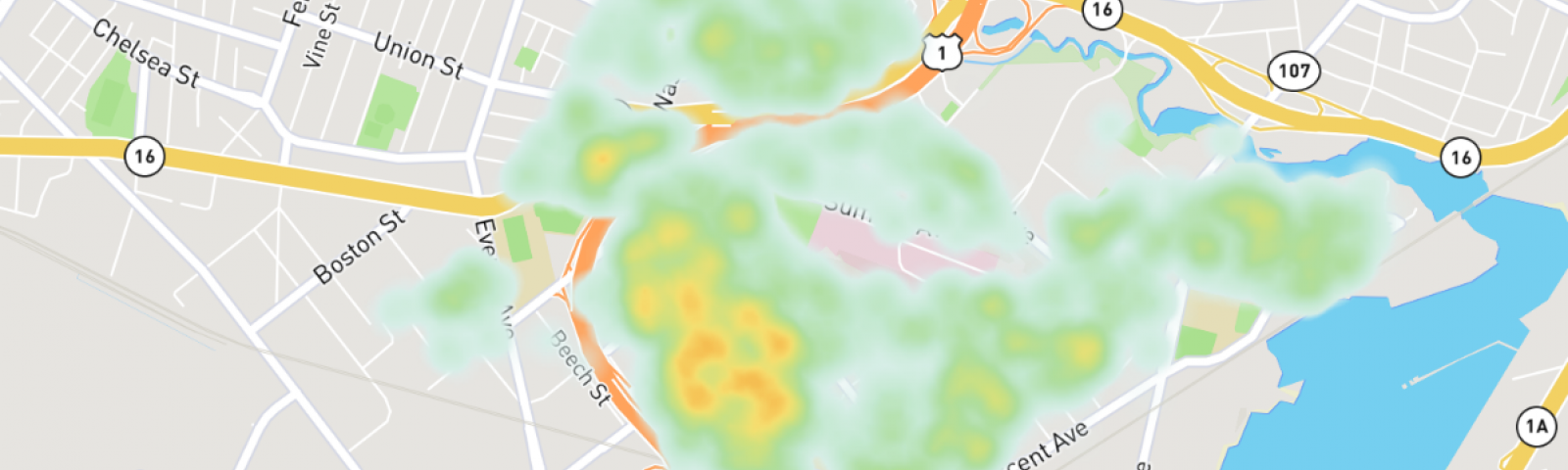
As the cities mentioned above have demonstrated, GIS has proven tremendously powerful during the pandemic. Many of the efforts highlighted above have helped local and state governments manage their COVID-19 responses more effectively, but there is still room for improvement. Moving forward, the combination of predictive analytics with GIS tools should greatly help officials preemptively take action. For example, research is being conducted in Chelsea, Massachusetts using housing data to anticipate emerging COVID-19 hotspots. This research could be applied to help public health workers intervene in communities most at risk of experiencing an outbreak.
As the pandemic continues to surge in the US and other parts of the world, it is becoming increasingly evident that COVID-19 is here to stay. With government resources running thin, local leaders will have to continue to innovate, and GIS will inevitably play an integral role in making that happen. With the complexity of the challenges we are currently facing, as we have shown above, there is a no better tool to meet the needs of this moment.
 Stephen Goldsmith is the Derek Bok Professor of the Practice of Urban Policy at the Harvard Kennedy School and the