- September 6, 2017
- Civic Analytics Network
This article is excerpted from The Power of Data Visualization in Cities, a webinar hosted by the Civic Analytics Network (CAN) on July 20, 2017. The following is a lightly edited transcript of Los Angeles CDO Lilian Coral's presentation on the GeoHub, the city's public platform for exploring, visualizing, and downloading location-based open data.
A lot of the work that Chief Data Officers (CDOs) across cities do, while in the same spirit, has taken on many different forms. That’s one of the things that I find is interesting about the networking and the peer exchange that we have going on nationwide: we're all trying very similar things, but in different ways.
In the city of Los Angeles, we've focused on leveraging the city’s assets. One of the biggest tools that we've used for our mapping and visualization work is the enterprise licensing agreement we have in place with ESRI. That's really how we began the formation stage of our GeoHub work.
We’ve tried to use a lot of our data assets to leverage a pathway to transformation towards digitizing the city and set the foundation for a smart city. We know that in the future we're going to be doing a lot of interconnected work with an even greater number of datasets, public and private, so one of the things that I'm really trying to do is steward the data that is currently available in the city and figure out better ways of sharing, channeling, and exchanging it, even within the city enterprise.
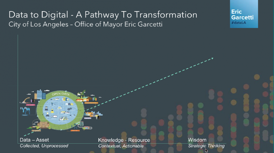
I like to use this graphic and visualization because our theory is that data by itself is not useful; it’s just an asset. Our goal is to convert that simple asset into wisdom and strategic thinking that the organization, the city of Los Angeles, as an enterprise, can really leverage.
Open data and specifically our first open data portal was really critical for us in that it really created an opportunity to see how much information the city had. We talk about it as an asset, but once our executive directive from our mayor became live and our department started sharing data—all different kinds of data—I think it was the first time that we could see, as a city, that this was a space where all city data could actually come together, and there was no other space like that.
And so Open Data 2.0, as we call it, was about now trying to leverage that one central space for open data and take it to the next level through various data analytics projects and the creation of digital services—by converting all that asset data into knowledge and resources.
The 2.0—taking that data into the wisdom space and turning into strategic thinking—is focused on connecting data from the various departments into a single space and trying to create more real-time connections and live connections, so that data is always coming from the system and is not just an extract that's uploaded every now and then based on someone's time or belief that it needs to be updated. And that's where the GeoHub system has really helped us flow.
So in the Open Data 2.0 phase, what we started to do is not just move from extracts that were coming from departments, but actually move data from GIS systems in real time to the featured service onto the GeoHub. And that, we believe, was really critical to creating more of the data exchange sharing and collaboration that needs to happen to create innovation in the city space.
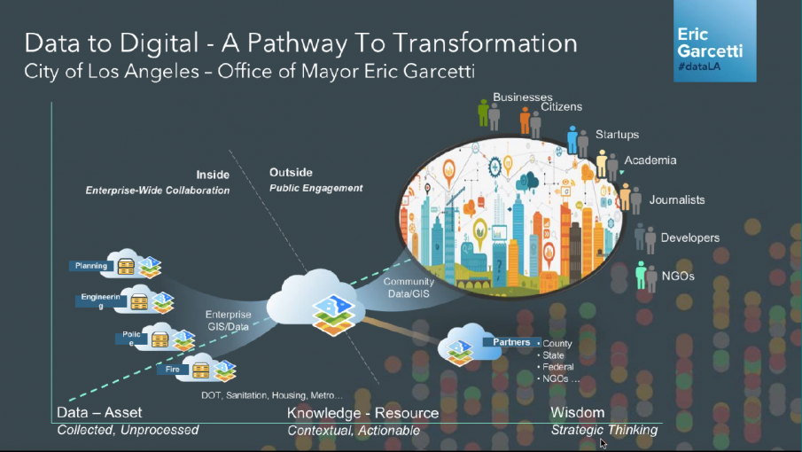
One of the things that we focused on was also, not just creating a way for the data to come in real time into that central space, but also creating functions within that space so the staff within the city could develop web apps, maps, and applications that drive operations or explain to the public what that data means and how it impacts their daily lives.
The other thing that we found in leveraging an ESRI system that we had across the city and that's available in a lot of different levels of government is that then we could bring in different partners, like the county, state, and federal governments, and NGOs, if they're using the same system.
One of the things that we actually love and appreciate is that on our GeoHub, we're also sharing a lot of data with our county. Los Angeles, our county, is the actual provider of Health and Human Services. In some of the cities in the county, those functions are comingled with the city space, so there is a lot of collaboration that's needed on key issues. The ability to have a platform that lets us exchange information in a seamless way was really important to doing all that work.
This next slide is the way the GeoHub is concocted. The partner shares data into the hub and the hub has a public and a private space. The private space is the place where public employees can really share data, collaborate, and create groups by department or sub-department. Then, there is a public space where they can make that conscious decision to push that data into the public realm.
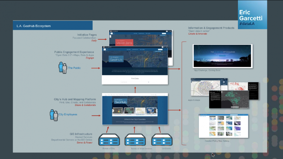
The other key thing for us was trying to look at, not just open data, but a data management strategy, overall. We want to be able to manage all of our data and figure out which datasets should go public and which should not. That should be part of the business process and the flow in which data travels across the city. It shouldn't be an external function to the business process. We think that is also what helps to maintain the frequency of data updates.
And then the idea is that the data has to be put to work, so we have to build web apps and maps. Sharing a lot of those apps and maps is what can create different perspectives, different insights on different issues, and hopefully more innovative ideas for how to solve them.
What we've been able to produce are different kinds of applications. I'm just going to show you some visualizations of things that we've been able to do. One is display data in a much more user-centered way. And for the example of that you're seeing right now, Street Wize, we're actually pulling in data that was available to the city but just had never been visualized in a way that's easy for people to actually manage the information and do something with it.
With the development of Street Wize—and this is a visual of all projects that are creating obstructions in the public's right-of-way—what you're seeing is that we created an application for three clients. One was the public, just Angelenos at home wanting to know, what's all that noise outside the house and how long is it going to be taking away parking spots. They can easily put in their address or, again, the map will naturally locate your position and tell you what's going on around you.
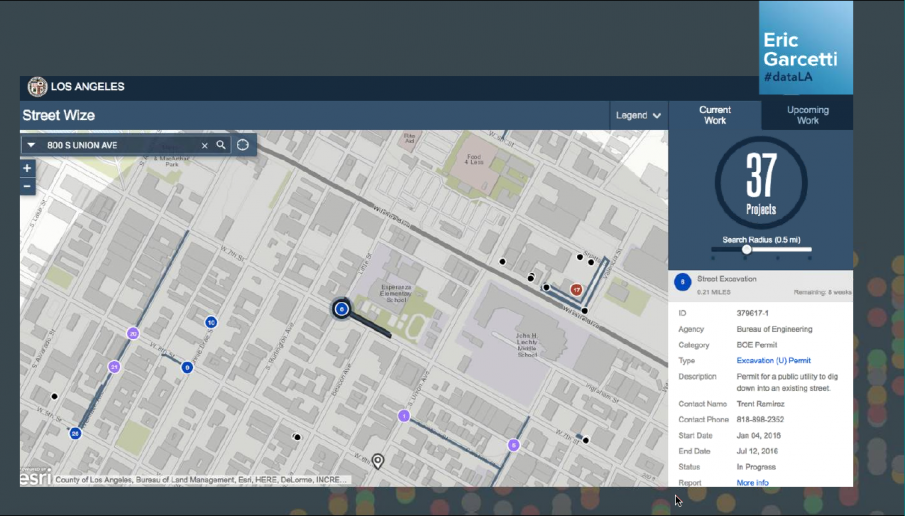
The other user that we defined on this was developers. There are a lot of private entities wanting to use the public right-of-way, many of which don't know what's going on, but would like to coordinate their work.
And then the third user is internal city staff who have to approve permits, often without being able to map the data or see current or upcoming work. In the upcoming work tab you can pick your date. Sometimes there is a lot of work that's happening on the same street, or on adjacent streets, and none of that was being coordinated, and that's something that we know is inefficient and we want to make improvements around.
A tool like this—with simple design and clear users—has really enabled us on the visualization front to take data from just being an asset to something that allows us to be more strategic with the way that we're deploying these resources.
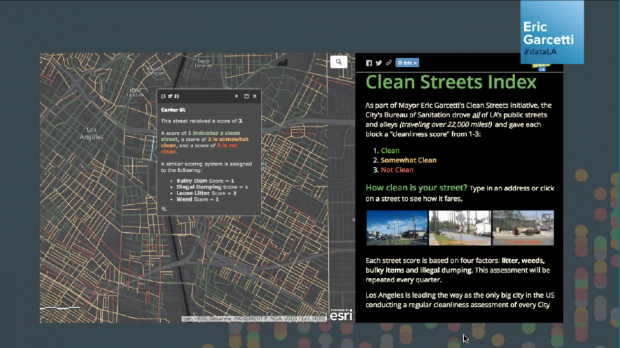
My second example, in terms of the visualization work we've been able to do through features that come out of the GeoHub, is our Clean Streets Index. This is an example of where we've taken the data-driven program approach and designed a program fully focused on collecting data about assessments of the cleanliness level of every single street in Los Angeles, and then used that to create an index and a score that drives operations. So now we know where concentrations of “not clean” streets are in the city. Our mayor was able to then set a goal that we will not have any three “not clean” grids in the city by 2018, and then just within a year, our sanitation department has been able to use this approach, this application, to drive down the number of unclean grids by 80 percent. So already, just with a bit more information at our disposal, we can get more tactical about issues like street cleanliness and create a more equitable, cleaner Los Angeles.
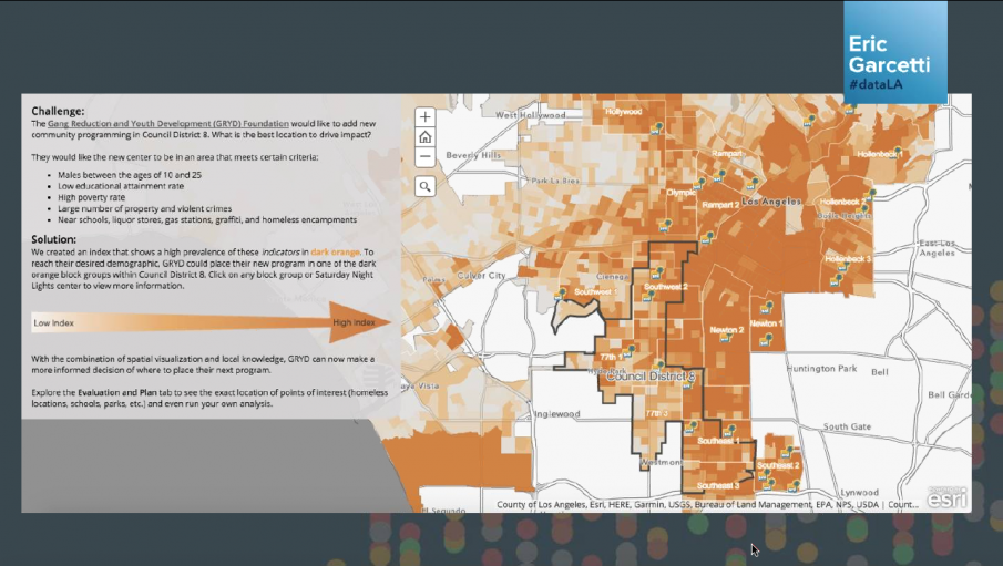
For the third example, we’ve tried to use data to plan and evaluate the effectiveness of our services. So in one case we looked at crime and crime data that we've been publishing for a long time and we mapped that crime data to the street segment level. We have a program within the Mayor's Office that's focused on the reduction of gang involvement by youth. What we've done is we've been able to marry our crime data with our grid team focus area—which is males between 10 to 25, low educational rate, high poverty rate, large violent crimes—and have used this information to inform summer programming. Now, post summer, the team can actually use this information and think through a before and after. How effective was it at impacting crime in those areas?
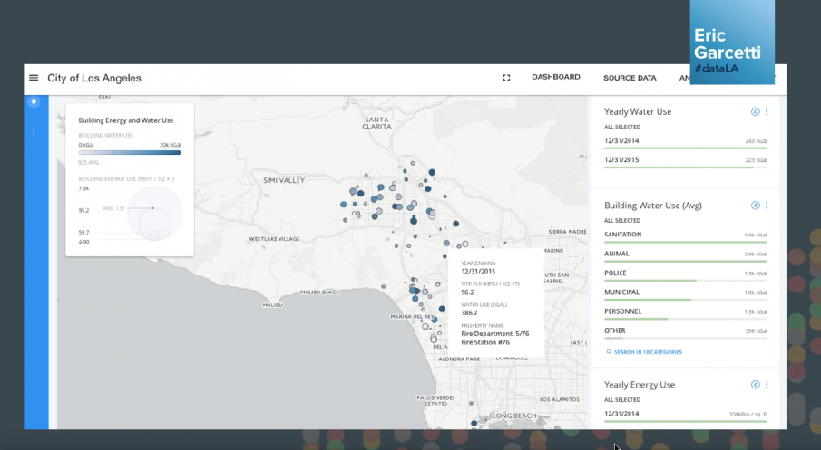
And the fourth example I'll show is also trying to do more self-service benchmarking. In this case, the city's been really aggressive. Our city is really focused on the impact of climate change, water and energy use, and conservation. So what we're doing now is, first, we passed an ordinance that requires that all city buildings’ water and energy use data be published. We, in December of 2016, passed another ordinance that extended that mandate to commercial and multi-family units. And now we'll be inputting that data here in the public dashboard, but will also be allowing those building owners to create a self benchmark so that they can try and focus on—if they're owners of multiple buildings—the buildings that are really driving up their use. They can also ask for things like water audits or energy audits that the city will provide, as part of an overall effort to reduce energy and water use across the city.
So ultimately the big thing here is about putting data to work and trying to drive more transformation across city departments. For us, the focus is on developing applications that have clear users and a clear outcome. With our energy and building efficiency, we're trying to get people to take an action—get water and energy audits so that they can improve their buildings. And it's really about creating more contextual applications that help us not just publish data on Excel datasets, but really allow the public, the average Angeleno, to engage with them, and really understand how data and the work that cities are doing to improve lives is actually impacting their own community, their street, their homes.