- Map
- New York City
- Association for Neighborhood and Housing Development

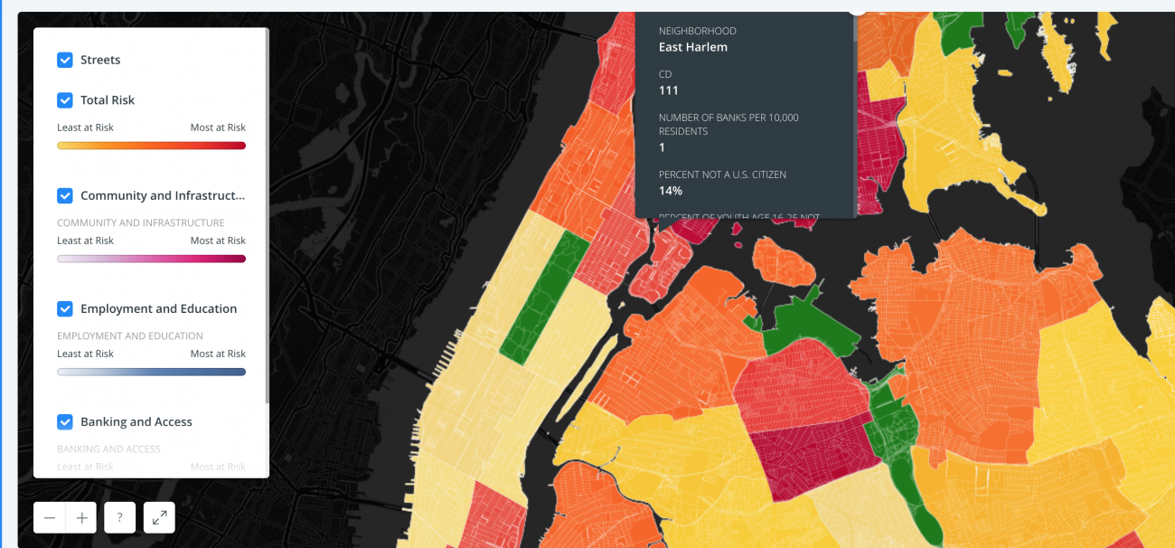
The interactive map allows users to see that problems they might be having in their neighborhood are not exclusive to their neighborhood and to consider comprehensive economic development programs that are citywide. The chart lays out 19 economic factors, disaggregating them by NYC community district. Some are obvious - poverty rates, percentage of households on food stamps, high school graduation rates, citywide economic development dollars spent. Some are less obvious, but essential to discussions of equitable economic development - percentage of local jobs paying less than $40,000/year, percentage of at-risk small businesses, percent change in land dedicated to manufacturing. With factors in columns and community districts in rows, the chart assigns each cell a color - red for high risk, yellow for medium risk and green for low risk. At a glance, users can see which neighborhoods and also which boroughs are most vulnerable or most in need of economic investment.
DATASETS
U.S Census Bureau's 2011 Housing Vacancy Survey and the 2013 American Community Survey 1-Year Estimates, NYCOpenData, NYC Depart of Finance Data, the NYU Furman Center's "Data Research Tool," the University Neighborhood Housing Program's (UNHP) Building Indicator Project (BIP) database, the FFIEC Home Mortgage Disclosure Act data, and data from The Institute for Children, Poverty, and Homelessness (ICPH).