- March 31, 2020
- Data Visualization
The coronavirus has officially put a stranglehold on America. City life as we know it has been brought to a grinding halt, particularly in some of the country’s most vibrant metros such as New York City. As we all await the end of this crisis, people everywhere are pulling up maps, watching as data visualizations demonstrate the spread of COVID-19.
On a global scale, stopping the pandemic requires we follow a few basic rules: keep your distance from others, stay inside whenever you can, wash your hands thoroughly, etc. Those rules apply to everyone regardless if your city has only a few cases, or tens of thousands. However, individual communities will have unique concerns based on specific local conditions. For example, some communities have a disproportionate share of the population with health conditions that make them more vulnerable to the adverse outcomes of COVID-19 infection. How that community chooses to respond to this outbreak will differ from a community that has a different set of conditions such as higher levels of concentrated poverty.
Since needs vary from community to community, local responses fall to local leaders. City, county and state health departments and agencies prepare for potential events like this, and no one knows the health or economic needs of their communities better than them. The difficult task is not identifying those needs; however, it's communicating what they are to residents in a way that inspires collective action. This is where maps sharing information on the local level play an extremely important role.
We are starting to see excellent examples of local governments building maps made to help share critical information with residents about the outbreak. Below are a few examples:
Identifying High-Risk Communities in Canada
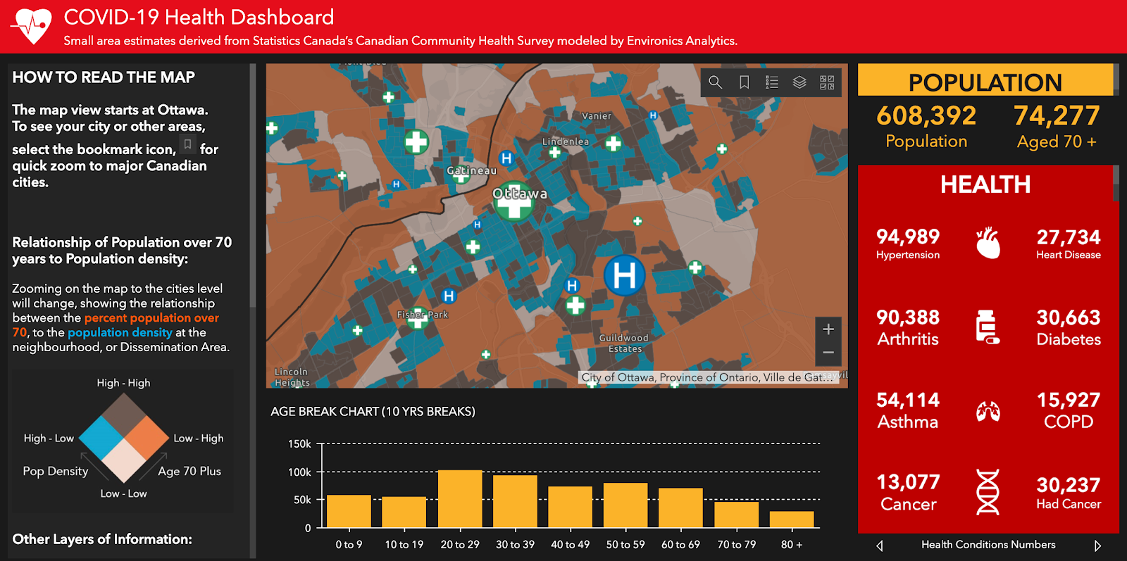
To identify which communities in Canada were at highest risk of adverse impacts from the outbreak, local governments can use the COVID-19 Health Dashboard. The map uses small area estimates from Canada’s Community Health Survey to classify risk by comparing the population of people aged 70-plus to the overall population density. To further communicate the risk to those communities, the dashboard highlights the number of people locally who have pre-existing conditions such as COPD, cancer, or hypertension that put them at even greater risk. The interactive map allows users to zoom in to any province across the country and view their own communities. It also highlights nearby medical facilities and the services they provide.
Crowdsourcing Grocery Store Inventory in Cobb County Georgia
In an effort to create one central location for all coronavirus-related information, Cobb County Georgia created the Cobb County COVID-19 Community Hub website. Site visitors can see a dashboard showing the number of cases in the area and can check in for up-to-date information about what is happening locally. There are also a series of maps residents can explore including where there are current cases, where food assistance programs are located, and where there are emergency medical facilities.
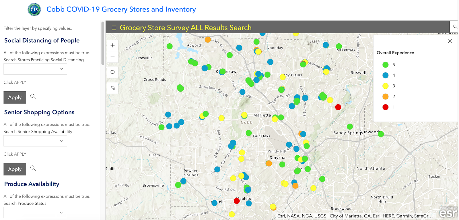
The map below is from Cobb County’s COVID-19 Grocery Store and Inventory Hub, a crowdsourcing effort designed to provide an up-to-date view of where essential supplies are in stock at local grocers. Shoppers fill out surveys anonymously about the locations they have been to and answer questions about the supply of toiletries, produce availability, over-the-counter medications, and even the precautions stores are taking to protect patrons. As of March 28, nearly 250 people have completed these surveys.
Mapping Community Assets in Baltimore
To help provide information to the city’s most vulnerable residents, Baltimore’s City Council President, Brandon Scott, quickly created and released a user friendly, interactive map of city resources. The map highlights food distribution sites for children and seniors, special grocery services for seniors, and clinics where uninsured residents can receive medical care. Residents can search for services near them and click on each icon to learn more information about their location or service of interest. As of March 28, the map has been viewed just over 13,000 times and Councilman Scott has called on the public to provide further feedback to help improve the map’s functionality.

Additionally, to fight food insecurity during the outbreak, the city also released a Free Food Site Locator map that allows residents to enter their address and find information on free food site locations within a 2 mile radius of their home.

Locating Coronavirus Assessment Sites in Jefferson County Tennessee
Similar to Cobb County, Jefferson County Tennessee has built its own County Coronavirus Response Hub website to consolidate information for local residents. What makes this map different is its sole focus on response measures and healthcare access. There are several maps featured on the site including, one highlighting the number of licensed hospital beds available in the county, another showing where healthcare providers are located based on care needs (i.e. PCP, Specialists, Emergency Medicine), and a third showing where there are travel advisories.
One particularly important map (shown below) directs residents to the nearest coronavirus “assessment site” so that they can be evaluated and potentially tested for the virus. This map is overlaid with data showing where there are confirmed COVID-19 cases throughout the state and is updated daily.

Building a Regional Coronavirus Case Tracker in Montgomery County
Montgomery County Pennsylvania has also created its own website to consolidate information for local residents and businesses. Similar to Baltimore, they have included a map identifying emergency food sites for adults as well as children that are out of school. Rather than focus on highlighting the number of cases locally, Montgomery County has included a map of the southeastern Pennsylvania region that includes the surrounding counties of Delaware, Chester, Bucks, Philadelphia, Burks, Lehigh and Lancaster. Providing regional context helps locals maintain situational awareness about what is happening outside of Montgomery County, without having to visit other county websites.

As the situation evolves, we will continue to search for local mapping best practices in the hopes of highlighting and sharing those stories with cities across the globe. If you are currently involved in using maps to combat the spread of coronavirus in your city, or you know of an innovative project taking place right now in a city anywhere in the world, please share your stories with us.